15. 1990 Topps

Right off the bat I have one that might surprise some people. I wouldn't be surprised to find this set on the "ugly list" of some collectors. For me, somehow this design just works. I liked the different colored borders for different teams, and the way the picture was allowed to bleed over the team name.
14. 1989 Donruss

My reaction to this set is very similar to 1990 Topps. I've always thought the way the 2 colors of the top and bottom border bleed into each other looks very sharp. The one downside to this set is that the dark borders and Donruss' choice of card stock made it quite a challenge to find a copy of Griffey's rookie card that doesn't have white marks along the edges - even the slightest ding becomes immediately visible!
13. 1993 Donruss
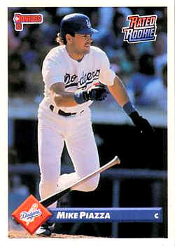
After a few years of pretty poor set designs, Donruss got themselves back on track in 1993. The team logo and player name set inside a 3D-looking box made for a simple, yet attractive design.
12. 1996 Score Select
Select used a similar design in 1995, but this set was the one that really caught my eye. Having 2 pictures - one a close up, one an action shot - is almost always a good look. And the wood grain panel on the left side called back to another favorite set that will be appearing later on in this list. There might be some personal bias to this choice, because this set produced one of my absolute favorite Griffey cards, thanks to a perfect choice of photo:
I still remember staying up late to watch Game 5 of the Mariners/Yankees series, and it remains one of the best baseball games I've ever seen. This shot was taken right after Griffey scored all the way from first with the winning run on an Edgar Martinez hit.
11. 1998 Stadium Club
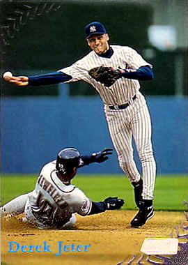
I love the embossed seams in the corners of this set. The shiny blue foil used for the player names was another unique touch - I don't think I've seen that color of foil used since, and it really should make a comeback sometime in the future.
10. 1995 Donruss
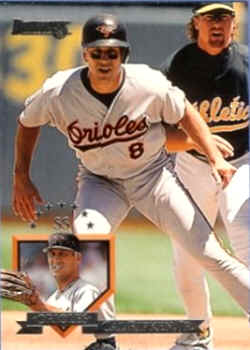
Similar to '96 Select with the inset picture, but I like this one better because they have a larger main photo. The home plate box and banner for the player name are nice touches. The only negative is that the name can be a bit hard to read since it is all silver foil
9. 1995 Leaf
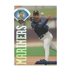
These snazzy cards featured a semi-holographic image of the player inside of a baseball diamond. The gold foil script used for the player names looks really nice. In my "worst sets" post I said that when you have the team name grossly out of proportion to the rest of the card it usually means bad things, but this set was the exception.
8. 1994 Topps

A fine example of how nice a baseball card can look without foil-stamping, holographics, die-cutting, or any other bells and whistles. I love the home plate border, with the edges adjusted to go with the team colors of the player on the card. And that nice script for the name is something that has already come up on this list a few times, as it is something I definitely like on my cards.
7. 1989 Upper Deck
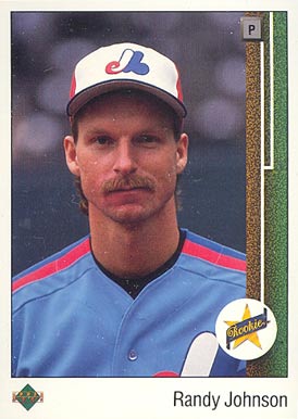
It's hard not to include the set that changed it all on this list. As I look over this list one of the common themes I see is that I like designs that incorporate things from the game (home plate in 1994 Topps, the baseball diamond in 1995 Leaf, the baseball stitches in 1998 Stadium Club), so it is no surprise that using the first base line for this design was a hit with me. Putting the player's position inside of "first base" really completes the look. My only complaint is the typewriter font used for the player name. (And on a side note, has Randy Johnson aged, like, at all? Seriously, this card is from 21 years ago!!)
6. 1993 Fleer Ultra (with a nod to 1992 Ultra as inspiration)
In 1992 Fleer Ultra used a similar design, and it wasn't a bad look....

...but the 1993 version brought several changes that really made an attractive package:

They switched to gold foil stamping for the player and team names, made the picture larger, and changed the marble-like border from pale green to tan, all of which makes for a much better looking card. And it might be a little cheesy, but I like the fireball in the Fleer Ultra logo as well.
5. 1997 Skybox Ex-2000
I said at the start that I would generally focus on more traditional, less gimmicky set designs for this list. This is one of the exceptions, because that sky/sunset background just looks too freaking cool. Somehow I completely missed this set when it was released, but when I found the Griffey from this set years later I immediately decided that I need to try and collect this whole set, which is a reaction I have had to very few set designs over the years.
4. 1995 Upper Deck
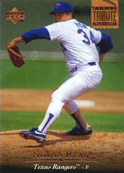
As the old saying goes, sometimes less is more. An extremely simple, yet elegant design puts '95 Upper Deck near the top of the list. I remember at the time being struck by how nice the copper-colored foil looked as compared to gold or silver.
3. 2008 UD Masterpieces

This set was love at first sight for me. Painting-style cards are hit or miss from my view, I either absolutely love them or hate them with a passion. This set, with the beautiful "picture frame" foil border, was without a doubt a home run in my book.
2. 1993 Upper Deck
I can't quite put my finger on why, but this set has always been among my absolute favorites. Maybe it is because it incorprates so many of the little touches that I highlighted in the other entries on the list - picture allowed to cover the card company/team name (1990 Topps), the bar that fades from one color to another (1989 Donruss), gold/copper-ish lettering for the player name (1995 Upper Deck), crisp design without hi-tech additions (1994 Topps), and a nice font script for the player name (half the list). It's simple, but man do I still love this set!
And my #1 favorite set design of all time.............
1. 1987 Topps

I said there would be another wood-paneled set later on in the list, and here it is! And OK, I'll admit it - there is a definite nostalgia bias to this choice, as it is the first set I ever collected. When I think about why I love baseball cards, images of this set are always among the first things that come to mind. But honestly, with the possible exception of the type font used for the player name, I think this design still holds up. And that rainbow-colored Future Stars logo needs to make a comeback TODAY!
Well there you have it! I look forward to hearing any comments people have. What set did I forget? Were some of these way off base? Let's hear it!
Some interesting choices, I think your top four are nice looking sets but honestly most of the rest wouldn't make it on my top 15...especially the '89 donruss and the '95 Leaf, I'm not a huge fan of those two.
ReplyDeleteInteresting list though, enjoyed the read.
That's the great thing about collecting... there's a little bit for everyone. If I made a list... some of your sets would make mine... others would not. A couple that would be on my list are: 1994 Flair & 1997 Flair Showcase. Great post!
ReplyDelete@Fuji - thanks! Yeah, those Flair sets always looked pretty sharp. 1993 Flair and 1998 Flair Showcase were among the last to be cut when I was making this list.
ReplyDelete@Nathan - thanks to you too! I'm not surprised you are not a fan of the '89 Donruss, that seems to be the opinion of most people. I knew that one and 1990 Topps would be the two that were most likely to provoke a reaction of "OK, this guy's nuts" :)