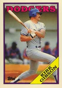
Since returning to card collecting on a regular basis I've found myself growing more and more frustrated by the card designs Topps puts out. Now don't get me wrong, none of them have been "bad" per se, but they have all been so plain and similar. I mean, how many times can you put out a set with a white border, silver foil, and little else?
 |
| Seriously, |
 |
| how |
 |
| many |
 |
| times |
 |
| ??? |
Now I may not like all of those (I've always hated the 1986 design), but 25-plus years later and I can tell you without hesitation exactly which year those cards are from. 25 years from now I highly doubt I'll be able to say the same about the 2010-2014 Topps issues. I would be happy to endure the occasional ugly design to get others that are fresh and exciting.
Which is why I was so happy to see the new design for the 2015 set:
Is...is that COLOR?? And colors that change for each team??
Seriously, this made me SO happy. Thank you Topps for doing something a little different. And please, MORE of this!!
As far as the other previews of the new set, I am definitely interested to see what the Rainbow Foil parallels look like. Shiny and colorful are almost always a hit with me, so I could easily envision myself putting together a Brewers team set if they turn out nice.
Of the inserts we know about, I love it when cards and history intersect, so I am most intrigued by the Baseball/History set which combines famous historical events with baseball events that happened on the same day:
The Gallery of Greats set also looks nice. I am hoping that in person they have a little more of a "painting" feel to them, but it appears in this image that they are just regular photos:
I also love the "Future Stars" rainbow logo pin cards. I very much hope that a Brewer is included in that set because that card will immediately go onto my want list:
Is it February yet??


I think people are getting blinded by the splash of color in 2015 Topps. If you take away the color, the rest of the components look exactly like 2010-2014. Name, position, team logo all at the bottom with some type of jump or swoosh on one side or the other. Well 2012 and 2013 didn't have position, but the point remains the same. We need something oddball like a 1959 design with a diamond instead of a circle or something with a pennant (a very underused design element) like 1965. Of course this is just my opinion and I love the 1986 design so you might not agree.
ReplyDeleteI actually agree with you to a point, it isn't THAT different. However I want to reward them for at least taking a step in the right direction! :)
DeleteBut definitely agree that my end goal is much more unique and daring designs, "oddball" or otherwise.
I agree and I am actually not mad about it. I'm just disappointed. This is like a former A student that fell to D's in junior high but came back with a C in high school. Yes, it's better and passable, but it's still not really what they are capable of doing. Sorry to sound like a parent there, but it's true.
Delete