10. 1998 Upper Deck

This was more a case of Upper Deck being a victim of their own success. Prior to this set I had almost always loved the Upper Deck base card designs. (You'll see some of those sets show up when I do my "Best Base Set Designs" post - coming soon!) This set was the first time that my reaction to opening up a pack of Upper Deck was "meh." Something about the dark border and silver foil really didn't work - it made the names really hard to read. I also didn't care for the oversized team name, also in that same dark coloring.
9. 1999 Upper Deck

Unfortunately Upper Deck didn't do much better the following year. These cards just looked funky, with borders on the sides but not the top and bottom. The way the border got fatter as you moved down the card and the angled lines in the silver foil only made it worse.
8. 1995 Score
Yeesh. That combo of tan and green borders was a poor decision, compounded by the odd polka dots bleeding into the green portion. I think this was the first year of that new Score logo, presumably it was supposed to be "edgy" or something. And speaking of edges, the "torn paper" edges around the picture and name box didn't do any favors for this set's visual appeal.
7. 1995 Topps

Topps went the same route as Score in 1995 with the rough edges around the picture, and it didn't work any better for them. And I have NO idea what was up with that weird "font" used for the player names.
6. 1991 Donruss

I'm usually pretty forgiving of the "pre-glossy coating and foil stamping" era card designs, since they had less to work with, but this set was just awful. It's like somebody at Donruss asked "How many different types of lines and colors can we cram into the border for no apparent reason?"
5. 2005 Topps
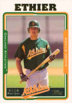
This is one of 2 entries on this list that come from the era that I was not actively collecting. When I saw this design I was glad I wasn't. As a general rule, whenever you have the player or team name at a size that is grossly out of proportion to the rest of the card you're getting into "ugly" territory. I would have thought Topps had learned their lesson from 20 years earlier (see below), but I guess not...
4. 2002 Upper Deck

This is the other entry from my non collecting days, and all I could think when I saw this was "what the HELL were you thinking Upper Deck?" That bottom area is just atrocious.
3. 1994 Stadium Club

You wouldn't think that a set that had so little in the way of actual design would be found on a list like this, but here we are. Which is worse - the person who said "I have an idea: we'll make the first name lower case and look like it was typed on a small scrap of paper, and the last name will be all caps and look like it came out of a 1970s Dymo label maker!", or the person who heard that idea and said "Brilliant! Go with it!"???
2. 1986 Topps

Yikes. Just yikes. What DIDN'T suck about this card design? The enormous bubble letters used for the team name. The gaudy colors. The player name that looks like it was printed on there using a 1960s typewriter. Brutal. You look at these cards and wonder what set could POSSIBLY have done worse than 1986 Topps??.......
1. 1991 Fleer

This. These are still the ugliest cards I have ever seen. And that's not just the current me saying that - I still remember my 9 year old self busting open a pack of 1991 Fleer, seeing that horrendous yellow border, and thinking "These are the most butt-ugly baseball cards ever made." When you manage to offend the aesthetic sensibilities of a 9 year old kid, you KNOW something went horribly wrong. Now I'm sure some of you would look at this set and say "Surely, some of these other sets look worse. I mean, come on, 1986 Topps!!". To that, I would have 2 replies:
One - what really offends me is the complete and total lack of effort and imagination put into this design. At least 1986 Topps TRIED to make something that looked different and interesting. They failed - horribly - but at least they tried. This design is boring to the point of tears, and smothered in one of the worst colors ever seen in the history of the hobby.
And two - don't call me Shirley.
I don't know if I agree with the whole lilst I definatley think I would have a few other sets on there, but i am in total agreement with #1. I was scrolling down the list thinking to myself what number 1991 Fleer would be at and blam #1. But 91 score and 1990 and 1988 Donruss would have made my list as well. Some of that wax outta the late 80's and early 90's was just terrible.
ReplyDeleteOut of all of those... I think the 1995 Score and 1994 Stadium Club are the worst. However... I've seen worse. How about those dumb Fun Packs that Upper Deck put out in 1993 or 1994. Those were terrible.
ReplyDeleteI might have also agreed with you on the 1986 Topps design a few months ago... but the set has been really growing on me as of late. I'm even considering busting some packs and building this set.