One Man's Thoughts on Sports Card Collecting

Tuesday, January 25, 2011

Nice Hit from Topps Chrome

At the same time that I bought my box of Topps Magic that produced the awesome Staubach auto, I also grabbed a few packs of Topps Chrome baseball.  Guess I was just super lucky that day, because I pulled this one-per-case card:


A left-handed pitcher/infielder - he's a man after my own heart~!

A quick google search revealed the following about Mr. Ramirez:

"He is listed as #41 on College Baseball Daily's top 100 players in the country.

The Anaheim California native attended Katella High School where he played under Carlos Ayala and Jimmy Valverde. As a senior, he help lead the Knights to an Empire League championship in 2008 while taking home the league’s most valuable player trophy. He was also named a three-time All-Empire League first teamer (2006-08) and was also named the Knight’s MVP each of those years. He also was named All-Orange County, All-CIF and high school All-American in 2008.

He made an immediate impact in the Cal-State Fullerton lineup by playing in 39 games hitting .287 with ten homers and 31 runs. He also served as the team’s closer appearing in 23 games while going 3-1 with seven saves and an ERA of 2.61. He was named 2009 All-Big West Conference First Team Utility Player while being named a Second Team Freshman All-American by Collegiate Baseball and Baseball America.

Ramirez continued to produce for the Titans appearing in 64 games while hitting .346 with
mound 27 times mostly as a reliever (one start) as he went 1-3 with eleven saves and a 3.50 ERA. He ended up striking out 38 batters in 43.2 innings.

He spent the summer of 2010 as part of the USA Collegiate National Team where Cal-State Fullerton head coach was serving as the pitching coach. Ramirez appeared in 16 games in the field hitting .290 with two homers and finishing second on the team with 14 RBI. He came up with a clutch extra inning two run single to center field to defeat Chinese Taipei in the FISU World University Baseball Championships.  He also appeared on the mound where he pitched in four games going 0-1 including one save with a 1.59 ERA."

Saturday, January 22, 2011

Trade with Collector's Crack

Yesterday I got my cards in the mail from cynicalbuddha over at Collector's Crack!

I sent him a handful of cards he needed from 2010 Topps Baseball, 2010 Topps T206, 2010 National Chicle, and 2009-10 Champ's Hockey, along with some Topps T206 minis and some cards from 2008 UD Masterpieces for his team and player collections.

In return, he came through big time on my 2010 Topps Baseball needs!  Between Series 2 and Update I needed a total of 77 base cards, and he came thisclose to finishing off the set for me, missing just 4 from Series 2 and only 1 from Update.  He also put a significant dent in my want list for the Vintage Legends, Turkey Red, and Cards Your Mom Threw Out insert sets.

Thanks CB!  Go Packers~!

Friday, January 21, 2011

2010 Topps Magic Football 2 Box Break with AWESOME Hit~!

My girlfriend and I both decided to buy a box of the new Topps Magic Football set after seeing how awesome the cards look.  The 3-4 hits per box was obviously another selling point, and as we sat down to crack open the packs she joked that we should have some sort of wager on who gets the best pull.

I won.


Chrome Refractor # 09/10

How awesome is that???  I may be a diehard Packer fan (and as such not a big fan of the Cowboys), but I still respect greatness, and there haven't been many better than "Captain Comeback."  He was a Heisman Trophy Winner, a 6-time Pro Bowler, took the Cowboys to the Super Bowl 5 times (with 2 wins and one MVP award), and was also a Vietnam Vet.  Now THAT'S a great pull!

But the fun definitely didn't end there.  My other hits were also pretty damn good:


Pigskin Parallel Mini #'d to 50

Jo's box was no slouch either, as she pulled TWO of the Stamp cards in addition to her 3 autos:

Historical Stamp of Approval #'d to 25


Gridiron Stamp of Approval #'d to 10

As far as collecting the set goes, my box did well on that front as well:

-145 out of 200 (72.5%) regular base cards
-8 out of 48 Short-Printed base cards (1:3 packs)
-6 Magical Moments (1:4)
-4 Rookie Stars (1:6)
-2 History's Best (1:12)
-19 regular white-bordered Minis (including 2 Short Prints)
-4 black-bordered Minis (including 1 Short Print)
-NO doubles (good job Topps!)

If there was one negative out of the evening, it is that the second box came up short in terms of finishing the base set.  After the first box I was missing 55 of the non-Short Printed base cards, and the second box produced just 13 of those I was missing, which was disappointing.  However, on the plus side the second box did produce the expected 8 base set Short Prints, 19 white-border minis (2 SPs), 4 black-border minis (1 SP), 6 Magical Moments, 4 Rookie Stars, and 2 History's Best, and the only doubles out of all of those were 2 of the Magical Moments cards.

Overall, this is possibly the most fun I've ever had opening a box of cards.  Obviously getting such nice hits has a lot to do with it, but also this set is just really cool!

HOT TIP!! - I don't know if this is normal or not, but in BOTH of our boxes the 3 autos were contained in the first 3 packs across the top of the box.  Keep that in mind if you happen to be at your LCS when they open a new box!!

Wednesday, January 19, 2011

Oddball Cards - 1990 Topps League Leaders

My LCS recently brought in a whole bunch of old, unusual boxes of cards from the mid 80s-early 90s era.  Among the pile of boxes of wax packs were several of a mini card set called Topps League Leaders from 1988, 1989, and 1990.  Somehow I had never heard of these before, and I always wonder what stores sold these sets back in the day?  I was ALWAYS on the lookout for baseball cards at any store my mom went to, but I never once saw these cards, or the old Topps Big sets, or any of that other oddball stuff...

Anyway, the boxes were selling for just $5, so I decided to pick up the box of 1990 and crack it open just for kicks. (Well, I also did it because I love the 1990 Topps set)

The 1990 League Leaders complete set is 88 cards.  That's an odd enough number for a set, but what is even more weird is that I saw from the other boxes that from 1988-1990 the Topps League Leaders set went from 66 cards, to 77, and then to 88.  My only guess as to why they did this is that somebody at Topps really liked Spinal Tap...

As one would expect, the design is reminiscent of the 1990 Topps base set:


The cards are maybe half the size of a normal baseball card, definitely larger than the minis you get today in sets like T206.

The backs highlight which categories they were leaders in the previous year:  (Ignore the website ad on this picture, I just didn't feel like scanning in the cards myself and did a google search instead)


Molitor was one of 3 Brewers in the set - the others being Robin Yount and a name I haven't heard in quite a while - Chris Bosio~!  While there are certainly a fair number of players you might not remember, the set also has quite a few stars and HOFers, including (among others) Ryne Sandberg, Roger Clemens, Tony Gwynn, Roberto Alomar, Nolan Ryan, Mark McGwire, Greg Maddux, Rickey Henderson and Barry Bonds.

Aside from the fact that many of the cards are cut really off-center, this was a fun little blast from the past. And I managed to pull together 2 full sets from the box~!

Monday, January 10, 2011

2010-11 Score Hockey 2 Box Break

After seeing some favorable reviews (and needing to satisfy my pack-busting urge with something cheap) I decided to purchase some 2010-11 Score Hockey.  I historically have not collected hockey cards, but I've started to become something of a fan of the sport and this just sounded like a fun, cheap set to collect.  My girlfriend decided to buy a box as well, so the results of 2 boxes are as follows:

Base Set - 296 out of 500 (59.2% of the set), 74 doubles
Glossy Parallels - 72, including 6 Hot Rookie glossies (3 per box), no doubles
Hot Rookies - 21 out of 50, 15 doubles
Playoff Heroes - 12, 5 doubles
Net Cam - 6, no doubles
Sudden Death - 4, 2 doubles
Snow Globes - 2, no doubles
Franchise - 1 (Hemsky)
20th Anniversary Parallel - 1 (Hot Rookie McCarthy)
French Back Parallel - none

I unfortunately also did not get any of the autos or rookie redemption cards.  I wasn't surprised to not get an auto, since those seem to be fairly rare, but some of the other posts I've seen around the Net said there was supposed to be one rookie redemption per box, so it seems odd that I wouldn't get one in TWO boxes...

There were both some big positives and negatives from this break:

The Positives - the card stock feels really sturdy for such a cheap set; good photography, there were a good number of shots that made me stop and say "that's a cool one!"; while the set design didn't do much for me personally, I understand that it is a recreation of the 1990-91 Score set so I'm sure it's fun for long-time hockey collectors; a couple of really nice insert sets in the Net Cams and Snow Globes

And perhaps most importantly, I got a net cam of former Milwaukee Admirals goalie, Peeeeeeekkaaaaaaaaaaa  Rrrrrrrrrine~!

(As an aside, I think Panini/Score missed out on the Snow Globes cards.  I think it is a FANTASTIC theme for an insert set, and don't get me wrong, I do like these cards, BUT if ever a set needed just a little holo-foil or some type of glittery visual effect it's this one!!  I know this is a base card set, but they already shelled out to do the die-cutting, couldn't they have gone just one more step to complete the snow globe look??  To me, that omission made the difference between merely a "good" insert set and a "great" one that I would have gone out of my way to collect!)

And The Negatives - really there is just one, but it's a big one - the horrible collation of the insert sets.  Considering these were two boxes out of the same case, it is simply unacceptable that the second box produced 15 of the same 18 Hot Rookies, 5 of the same 6 Playoff Heroes inserts, and the exact same 2 Sudden Death inserts.  Having 20% (74 out of 340) of the total base cards from the 2 boxes turn out to be doubles also seemed like a large number for a 500 card set, but I probably could have ignored that if it hadn't been so bad for the inserts.  Get it together Panini!!

On the whole, this did accomplish my goal of a fun and inexpensive way to bust some packs.  I saw some jumbo packs (i think 55 cards) at Target for $5, so I think I'll pick up a few of those and try to finish the set.

Friday, January 7, 2011

A Possible Steal from eBay

The latest addition to the Griffey Collection was the result of a random impulse bid on eBay:


1998 Pinnacle Platinum Gold Promo #53

I bid on this card on a whim when I was looking to see if any of the Pinnacle Bankruptcy Griffeys were out there, having just become aware of their existence when I stumbled onto this website: http://thejuniorcollection.com/RareFinds.php (I was looking for the Pinnacle Select Griffeys.  If anyone ever sees these out there in the marketplace, let me know please!!)

I was paying so little attention when I bid on the card that I didn't even notice that it was a promo card and not the regular version (yes, I somehow missed the giant "SAMPLE" in the picture.  I blame the small screen on my cell phone).  I decided to look and see if there were any other versions of this promo on eBay and what they are selling for, and much to my surprise I found three others selling for buy it now prices of $48, $60, and $120!  Now this doesn't necessarily reflect the true price, since we all know people will sometimes list cards for super high prices hoping some sucker will buy it, but still it made me feel awful good that I got mine for a grand total of $7.69~!

Monday, January 3, 2011

15 Best Base Set Designs

When I sat down to put together a list of my favorite base set designs as a followup to my Worst Base Sets post I quickly realized this list would be much tougher to do.  As a collector I am naturally predisposed to like far more sets than I dislike, so putting together a list of those that stood out in a bad way was easy - narrowing down a list of great designs to just 10 would be almost impossible.  So I decided to bend the rules a bit and expand this list to 15 entries instead.  As was the case for the bad designs post, most of these will come from my peak era of collecting (1987-2000).  In general I avoided the expensive, premium sets, choosing instead to focus mostly on those sets that looked good without resorting to various gimmicks (with one or two exceptions).  And so, without further ado, the Top 15 Best Base Set Designs!:

15.  1990 Topps


Right off the bat I have one that might surprise some people.  I wouldn't be surprised to find this set on the "ugly list" of some collectors.  For me, somehow this design just works.  I liked the different colored borders for different teams, and the way the picture was allowed to bleed over the team name.
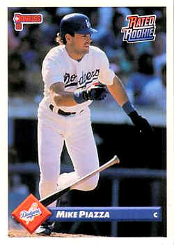
14. 1989 Donruss


My reaction to this set is very similar to 1990 Topps.  I've always thought the way the 2 colors of the top and bottom border bleed into each other looks very sharp.  The one downside to this set is that the dark borders and Donruss' choice of card stock made it quite a challenge to find a copy of Griffey's rookie card that doesn't have white marks along the edges - even the slightest ding becomes immediately visible!

13. 1993 Donruss


After a few years of pretty poor set designs, Donruss got themselves back on track in 1993.  The team logo and player name set inside a 3D-looking box made for a simple, yet attractive design.

12. 1996 Score Select


Select used a similar design in 1995, but this set was the one that really caught my eye.  Having 2 pictures - one a close up, one an action shot  - is almost always a good look.  And the wood grain panel on the left side called back to another favorite set that will be appearing later on in this list.  There might be some personal bias to this choice, because this set produced one of my absolute favorite Griffey cards, thanks to a perfect choice of photo:


I still remember staying up late to watch Game 5 of the Mariners/Yankees series, and it remains one of the best baseball games I've ever seen.  This shot was taken right after Griffey scored all the way from first with the winning run on an Edgar Martinez hit.

11. 1998 Stadium Club


I love the embossed seams in the corners of this set.  The shiny blue foil used for the player names was another unique touch - I don't think I've seen that color of foil used since, and it really should make a comeback sometime in the future.

10. 1995 Donruss


Similar to '96 Select with the inset picture, but I like this one better because they have a larger main photo.  The home plate box and banner for the player name are nice touches.  The only negative is that the name can be a bit hard to read since it is all silver foil

9. 1995 Leaf


These snazzy cards featured a semi-holographic image of the player inside of a baseball diamond.  The gold foil script used for the player names looks really nice.  In my "worst sets" post I said that when you have the team name grossly out of proportion to the rest of the card it usually means bad things, but this set was the exception.

8. 1994 Topps


A fine example of how nice a baseball card can look without foil-stamping, holographics, die-cutting, or any other bells and whistles.  I love the home plate border, with the edges adjusted to go with the team colors of the player on the card.  And that nice script for the name is something that has already come up on this list a few times, as it is something I definitely like on my cards.

7. 1989 Upper Deck


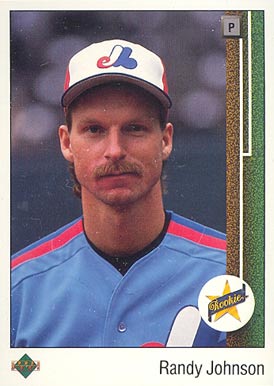
It's hard not to include the set that changed it all on this list.  As I look over this list one of the common themes I see is that I like designs that incorporate things from the game (home plate in 1994 Topps, the baseball diamond in 1995 Leaf, the baseball stitches in 1998 Stadium Club), so it is no surprise that using the first base line for this design was a hit with me.  Putting the player's position inside of "first base" really completes the look.  My only complaint is the typewriter font used for the player name. (And on a side note, has Randy Johnson aged, like, at all?  Seriously, this card is from 21 years ago!!)

6. 1993 Fleer Ultra (with a nod to 1992 Ultra as inspiration)

In 1992 Fleer Ultra used a similar design, and it wasn't a bad look....


...but the 1993 version brought several changes that really made an attractive package:


They switched to gold foil stamping for the player and team names, made the picture larger, and changed the marble-like border from pale green to tan, all of which makes for a much better looking card.  And it might be a little cheesy, but I like the fireball in the Fleer Ultra logo as well.

5. 1997 Skybox Ex-2000


I said at the start that I would generally focus on more traditional, less gimmicky set designs for this list.  This is one of the exceptions, because that sky/sunset background just looks too freaking cool.  Somehow I completely missed this set when it was released, but when I found the Griffey from this set years later I immediately decided that I need to try and collect this whole set, which is a reaction I have had to very few set designs over the years.

4. 1995 Upper Deck


As the old saying goes, sometimes less is more.  An extremely simple, yet elegant design puts '95 Upper Deck near the top of the list.  I remember at the time being struck by how nice the copper-colored foil looked as compared to gold or silver.

3. 2008 UD Masterpieces


This set was love at first sight for me.  Painting-style cards are hit or miss from my view, I either absolutely love them or hate them with a passion.  This set, with the beautiful "picture frame" foil border, was without a doubt a home run in my book.

2. 1993 Upper Deck


I can't quite put my finger on why, but this set has always been among my absolute favorites.  Maybe it is because it incorprates so many of the little touches that I highlighted in the other entries on the list - picture allowed to cover the card company/team name (1990 Topps), the bar that fades from one color to another (1989 Donruss), gold/copper-ish lettering for the player name (1995 Upper Deck), crisp design without hi-tech additions (1994 Topps), and a nice font script for the player name (half the list).  It's simple, but man do I still love this set!

And my #1 favorite set design of all time.............


1. 1987 Topps


I said there would be another wood-paneled set later on in the list, and here it is!  And OK, I'll admit it - there is a definite nostalgia bias to this choice, as it is the first set I ever collected.  When I think about why I love baseball cards, images of this set are always among the first things that come to mind.  But honestly, with the possible exception of the type font used for the player name, I think this design still holds up.  And that rainbow-colored Future Stars logo needs to make a comeback TODAY!

Well there you have it!  I look forward to hearing any comments people have.  What set did I forget?  Were some of these way off base?  Let's hear it!